
If your website doesn’t work on a phone, you’re losing customers. That’s the reality for small businesses in 2025.
In a world where most people browse, shop, and book services from their phones, having a site that only looks good on a desktop just doesn’t cut it anymore. That’s where responsive design comes in, making sure your website adapts to all screen sizes, from big monitors to tiny smartphones.
At Aeger Creative, we build every site to be responsive by default, using modern layout tools and mobile-first designs. Let’s walk through why this matters so much for your business.
What is responsive design?
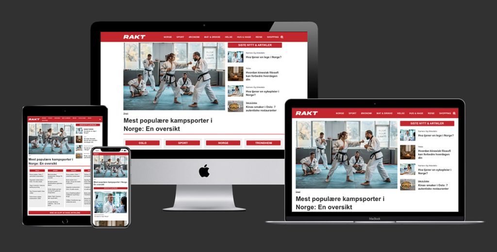
Responsive design means your website automatically adjusts to fit any screen.
Instead of creating separate versions of your site for desktop and mobile, a responsive site rearranges its layout using flexible grids, scalable images, and CSS media queries. The goal? A smooth, consistent experience for every user, whether they’re browsing on an iPhone or a laptop.
Think of it like this: Your website becomes “fluid,” flowing to fit the space it’s given.
Why responsive design matters in 2025
1. Most of your visitors are on mobile
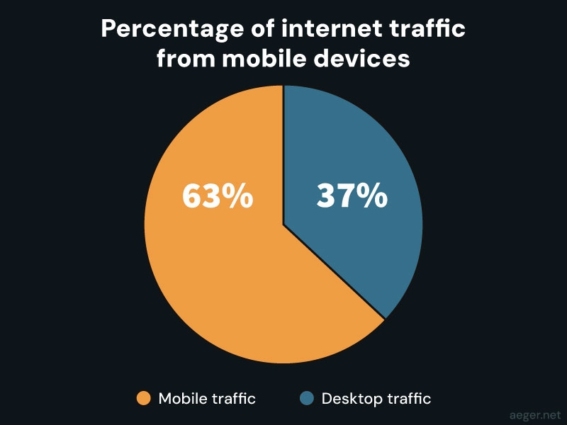
Over 60% of web traffic now comes from mobile devices. If your site isn’t optimized for phones, it’s likely frustrating half of your audience and potential customers.
Small text, cut-off images, hard-to-tap buttons — all of these drive visitors away. A responsive website ensures your content is easy to use and understand, no matter the device.
2. Google rewards mobile-friendly sites
Google uses mobile-first indexing, which means it ranks your site based on how it performs on mobile. If your site isn’t responsive, your search rankings — and traffic — will suffer.

That means responsive design isn’t just about looks. It’s actually measured by Google and can directly affect rankings.
Aeger Creative offers ongoing SEO support to help small businesses grow. Learn more about our services.
3. Better experience = better results
Responsive websites offer faster load times, smoother navigation, and better engagement.
Visitors stay longer, bounce less, and are more likely to click or convert — whether that’s buying a product, filling out a form, or calling your number.
This leads directly to better ROI on your marketing and ad spend.
4. Looks professional and builds trust
People judge your business based on your website.
A modern, responsive site shows you’re current, credible, and care about your customer’s experience.
An outdated or broken mobile site, on the other hand, sends the opposite message.
5. One site = easier updates and lower costs
Responsive sites are easier and cheaper to maintain. You don’t need separate mobile and desktop versions — just one site that works everywhere.
When you update a page, post a blog, or change a product listing, it automatically looks good on every screen. That saves time, reduces errors, and keeps your business agile.
Signs your current site needs a responsive upgrade
Not sure if your website makes the cut? Watch for these red flags:
- High bounce rates from mobile users
- Slow load times on phones or tablets
- Menus or images that look broken or crowded on small screens
- Customers saying your site is “hard to use on their phone”
- Your site ranking well on desktop search but poorly on mobile
- Poor results on Google’s PageSpeed Insights (test your site here)
If you’re seeing any of these, it’s time to act.
Let’s make your website work everywhere
At Aeger Creative, every website we build is responsive by default. Whether you’re launching something new or need to refresh an existing site, we’ll make sure it’s mobile-ready, fast, and built to grow your business.
Need help figuring out your next move? Let’s chat.
👉 View our work or check out our pricing to get started.
FAQ: Responsive Design for Small Businesses
What’s the difference between mobile-friendly and responsive?
Mobile-friendly sites work on phones but might look the same as the desktop version. Responsive sites adapt — they change layout to fit the screen perfectly.
Do I need a separate mobile site?
No — with responsive design, one site works everywhere. This simplifies your workflow and lowers maintenance costs.
Will responsive design help my Google rankings?
Yes! Google favors mobile-optimized websites, and responsiveness is a key ranking factor.
Can I make my existing site responsive?
Often, yes. Depending on your platform, we can retrofit your layout or recommend a cost-effective rebuild.
How much does a responsive website cost?
Our custom WordPress and Shopify builds start affordably. See pricing here, or request a free consultation.